I have low vision and so I use the web differently than other people, and even from other vision impaired people. I find that I’m explaining this a couple of times a month, so I thought I’d write it down and save myself time in the future. I can also make it generally available for the curious here.
My eye sight
Copyright 2010 Jon Ruddle & Paul Bone
Copyright 2017 Paul Bone
I have low vision, the short explanation is that this means my eye sight is terrible. The longer explanation is that this is a level of sightedness, that is less than 20:70 (approx 18:60 in metric), while legal blindness begins at 20:200 (or 6:60). It can also include visual field loss, as can legal blindness, but that doesn’t apply in my case. I personally have a corrected visual acuity of something like 6:28 (metric) in the left eye and 6:60 (metric) in the right.
I am not an optometrist or ophthalmologist so I may have gotten some of the numbers wrong, and I’m not certain that the difference between how countries measure this is a difference in imperial vs metric. What I do know is that it’s a ratio between the patient’s vision and the population mean. If you’re looking at a painting and you’re 28 meters/whatever from it, then I have to be 6 meters from it to see the same detail. But it’s approximate, lighting and other conditions will affect everyone differently.
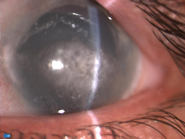
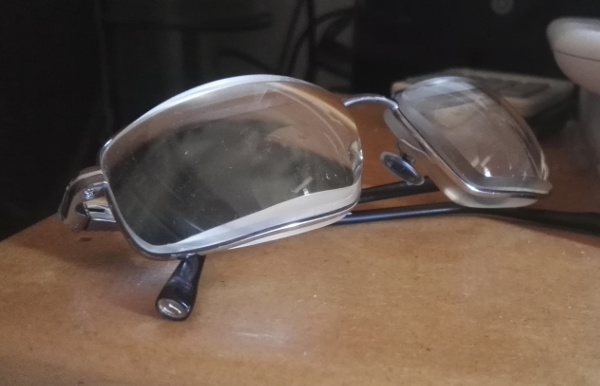
I was born with cataracts, often cataracts are just some layers of the lens, for me (and I think other congenital cases) it was the whole lens. I had surgery when I was four months old (I think) to remove the cataracts/lenses. Without lenses in my eyes I need very very thick glasses and cannot focus on nearer or further objects. I also have glaucoma, nystagmus and band kerotopathy.
My best corrected vision of 6:28 means that even with eyeglasses I am far from being able to legally drive a car, I need magnifiers to read the menu in the restaurant, a little telescope to see a presentation or street signs and sometimes I use a white cane, particularly in busy places like train stations. However I have enough sight to watch television, or go to the movies; which must look very strange when I go to the cinema using a white cane because it’s busy place!
How I use a computer
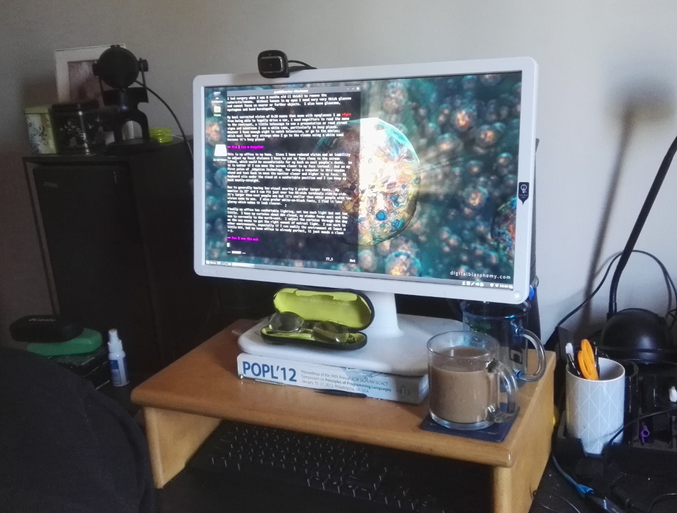
This is my office in my home. Since I have reduced vision and an inability to adjust my focal distance I have to put my face close to the screen (20cm), which would be uncomfortable for my back on most people’s desks. So it is better if I can move the screen closer to my face instead. And so my first piece of Adaptive Technology for using a computer is this wooden stand and text book to move the monitor closer and higher to my face. My keyboard sits under the stand at a comfortable position and I can keep my back mostly-straight.
Copyright 2017 Paul Bone
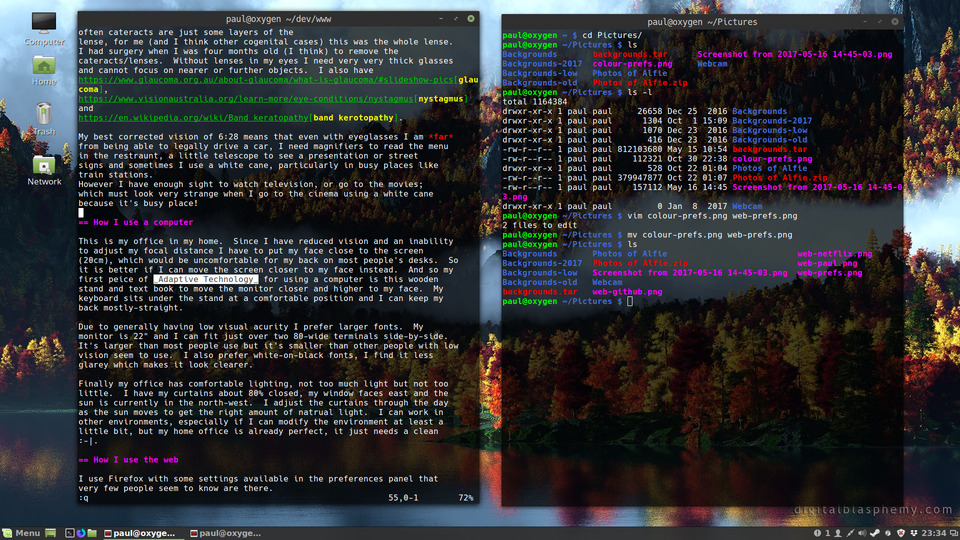
Due to generally having low visual acurity I prefer larger fonts. My monitor is 22" and I can fit just over two 80-wide terminals side-by-side. It’s larger than most people use but it’s smaller than other people with low vision seem to use. I also prefer white-on-black fonts, I find it less glarey which makes it look clearer.
Copyright 2017 Paul Bone
Finally my office has comfortable lighting, not too much light but not too little. I have my curtains about 80% closed, my window faces east and the sun is currently in the north-west. I adjust the curtains through the day as the sun moves to get the right amount of natural light. I can work in other environments, especially if I can modify the environment at least a little bit, but my home office is already perfect, it just needs a clean :-|.
How I use the web
I use Firefox with some settings available in the preferences panel that very few people seem to know are there. Yes I work for Mozilla, no this is not any kind of paid endorsement, I used Firefox in this way long before I had a relationship with Mozilla.
If you go to Preferences scroll down to Fonts and Colors, click Colors. In the new window choose white text, black background, a light-ish blue link colour and light-ish red visited link colour, don’t click Use system colors and choose Always for Override the colors specified by the page with your selections above.
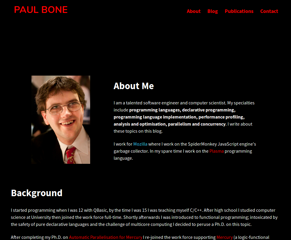
If you actually followed this now things will probably look very strange to you. This site looks like
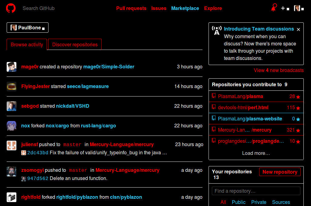
The difference this creates becomes more dramatic when you view a site you’re likely to be familiar with. Maybe you’re a developer and use github. Github looks like:
Web accessibility
Now that I have introduced how I use the web (something I find I’m often answering when people are curious). I’d like to go a little further and describe the specific accessibility problems I run into. As I covered earlier these are going to be different to other users' accessibility gripes, they’re specific to this particular configuration.
Firefox helpfully removed the background image of the ski resort from my home page. It needs to do this to make white-on-black text work. If it didn’t it’d be white text on a white background of snow - not very accessible at all. All it needs to do to do this is ignore any background CSS properties. The problem with this is that often people create small fixed size div elements with background properties to make icons and controls.
The place I notice this most days is facebook. Buttons like the thumbs up button in the messenger window. And emoticon/emoji/"gif" responses in messenger work like this. Frequently I will tell a great joke to a friend in messenger and they’ll send me back an empty space. Really there’s either a GIF of a minion laughing their arse off, or of Captain Picard facepalming, and I don’t know which, they’re both and empty black div in a bigger black div (the messenger window) to me. I work around problems with Facebook by just assuming everyone likes me. And if I never edit my posts to make corrections, it’s because the edit button is invisible.
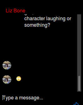
The large black area contains a great animated GIF, the kind many sighted people on the internet enjoy.
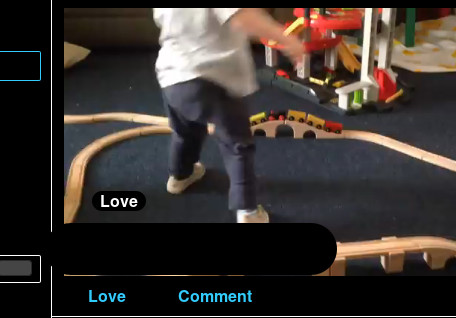
Choosing the appropriate reaction to a video of my son.
I’ve also noticed other sites use a different image-as-a-background to convey status. I was using sched.com this week and can’t see the difference between a selected "Yes I will attend" from a "No I’m not interested" event.
Finally I’m a bit of a hypocrite with this myself. I have used the background property to show the different statuses of items on the Plasma roadmap. If someone knows a better way to build this particular page, without using too much JavaScript please let me know. (Edit: Slavfox knew! And submitted a PR!)
There are also cases without background properties. Where people simply use colour, including text colour to convey meaning. The most common example of this is probably a web from, where you miss some field or make some entry invalid and it highlights the bad entry by changing its boarder colour to red. I don’t notice and often have to recheck the whole form.
In treehearder (a tool we use at Mozilla) a passing test is green and a failing test is red. Now if I break the build I can just say "But I didn’t know the tests were failing, they all look like passing tests to me!" I work around problems like this by filtering by failing tests only and seeing if any are shown on my screen at all.
This is sometimes also used when displaying code diffs. My work-around here is to download the text-formatted unified diff and read it the old fashioned way. Each of these things are fairly minor. And either I work around the problem in some way (I sometimes file a bug) or if it’s not important enough to me, I ignore that site, going instead to a different site.
There are plenty of web users who have things worse than I do, I’m not trying to paint a picture of hardship here. I can access a lot of web content relatively easily, either on my desktop with these settings or on my tablet with reader mode and pinch-to-zoom. I can perceive the page layout and use this as I navigate, this is surprisingly important and a profoundly blind web user will need other cues, such as accessibility tags to help them navigate within a page.
Generally I’m not willing to answer questions about web accessibility, I’m not an expert in this field, I’m just one data-point. I am happy to answer questions from friends, colleagues and other people I already know about this and my individual case. Thank you.
Update
After writing this I had a couple of extra thoughts I’d like to share:
The web is generally becoming more accessible for me. I think people are putting in more effort into accessibility. And things like responsive design and different DPI screens force web developers to make more sensible sites. For example enlarging a site is much more reliable these days since sites are more likely to use relative units rather than absolute pixels.
I can’t advise on how to write accessible websites. However a good first step is to use more semantic markup. Use a strong tag rather than a span tag with a font-weight property, something like this is more likely to be noticed by a screen reader. Tags like section and nav will also help users navigate sites better. Avoid using styling to convey semantics, and use semantic elements wherever possible.
Update 2018-02-26
I just found this great WebExtension (this one was fiddly) an even better WebExtension which makes a significant number of my dreams come true. I can read the text on the web in nice high-contrast inverse AND I can see icons and pictures. If you live with a disability then you know the feeling I’m having RIGHT NOW. If you don’t then understand this is a very nice/good feeling that you might not ever feel.